Forms
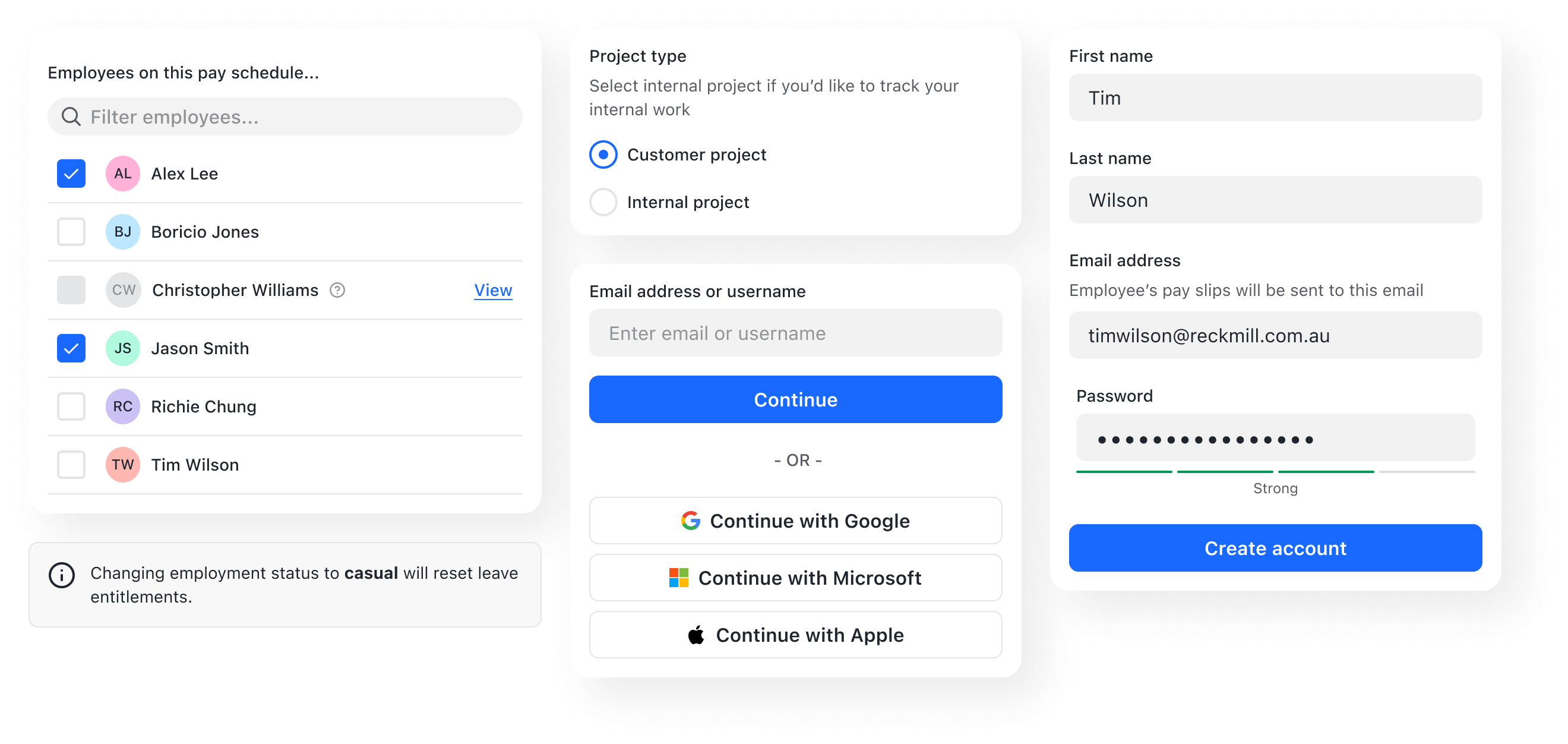
These conventions are intended to provide guidance for both layout and proper usage of various form elements.
Designing an effective form requires consideration for its information hierarchy, sequence of form elements, clarity of labels, affordance, feedback, and accessibility.
Form layout
Form layouts organise input fields for our users to enter data and configure options. A form layout should be easy to scan, understand and complete.
Typically, forms should be one column. Multiple columns can be disruptive to a user’s vertical momentum. However, related fields are sometimes represented as a group on a single row when a mental model suggests they be treated as a singular concept.
Create form sections using the Fieldset.
- If a form is organised in sections, each section should have a
legend. - If necessary, provide a concise description of what’s represented in each section.
Use the legendAppearance prop in circumstances where inputs should be
semantically grouped for screen readers, but presented as a single field for
sighted users.
Optional fields
Most inputs in a form should be required by default. Be mindful when requesting optional information. Added inputs increase cognitive load and the perceived effort required to complete a task. If you must ask a user for optional information, then denote it as “optional” in the label.
Text inputs
The length of the TextInput affords the length of the answer expected. Where appropriate employ this for fields that have a defined character count like phone numbers, post codes, etc.
Descriptions
Use descriptions to provide additional guidance with a form field. Descriptions
are added via the description prop. Use sentence-style capitalisation, and in
most cases, write the text as full sentences with punctuation.
Placeholder text
Placeholder text should be used to provide an example of the required data expected by inputs that have not yet been edited by the user. Placeholder text should not contain instructional information as it disappears on input, and makes it more difficult for users to check their responses before submitting the form. Prefer using a field description for instructional information.
While placeholder text provides valuable guidance for many users, placeholder text is not a replacement for labels or descriptions.
Good form solutions take advantage of input attributes and accommodating validation practices to prevent offloading the extra work onto the person who simply wants to use the app with as little complication as possible.
Checkboxes & radios
Always align checkboxes and radio buttons vertically.
Form submission
Most forms should have a submit button. Use the "bold" weight for a main call
to action and "subtle" or "none" for secondary actions. Always use descriptive
label text.
Never hide or make a form submit button disabled as a means of validation. Instead, always let the user press the form submit button and display the appropriate feedback to the user if the form submission fails e.g. a toast, or inline validation messages.
If the submit or CTA button is not used in a classic form pattern, for example a data table with inputs, then it's fine to make the button disabled as a means of validation, provided that it's clear why it's not clickable.
Asynchronous inputs should mostly be avoided. Use your best judgment when deciding whether or not your specific needs warrant one. Be sure to provide users with clear feedback about the state of the input and submission.
Inline validation
Validation should occur on input blur. Use the forms package to help.