Getting started
Learn how to quickly get started with our component library to build expressive, consistent UI at Reckon.
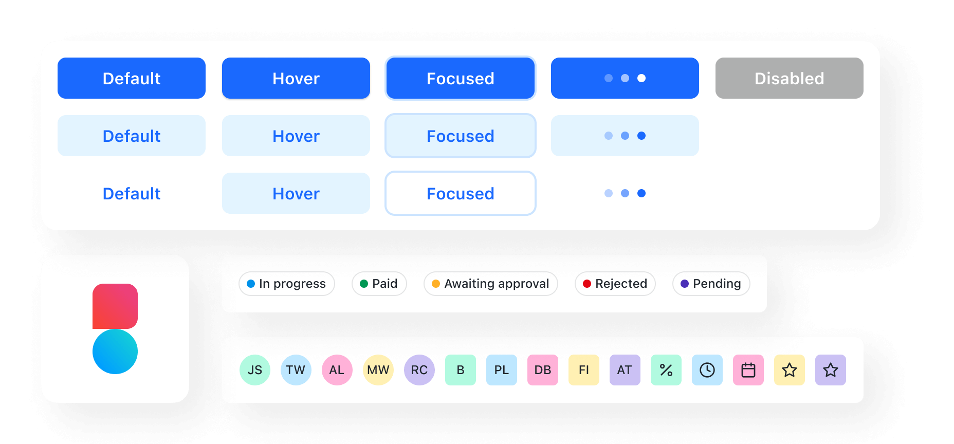
Components can be combined to help anyone building products for Reckon to efficiently design consistent experiences for users.
This frees us up to focus on solving unique user challenges, rather than reinventing interface elements that are already in use.

Development workflow
The component library was designed to help developers quickly create the best experience for Reckon users. Learn how best to build interfaces that properly leverage Balance by reading the Development workflow documentation.
Wrap your app with Core
In order to propagate Balance’s theme to the components, you need to wrap your
React app in Balance’s Core component:
import { Core } from '@balance-web/core';const WrappedApp = (props) => ( <Core> <App {...props} /> </Core>);Component methodology
We make our components flexible enough to meet diverse needs. Our components are set up to be restructured based on the information passed in. No matter what type of experience you’re creating, you can use components as the building blocks of your product or feature.
Each of our components has a well-documented public interface (API) with guidelines and well-defined conventions. This way, developers don’t need to worry about the underlying implementation. Instead, they can focus on creating great user experiences.
We ensure that our components are made for everyone. They meet accessibility standards and are responsive to most screens or devices. We also put a lot of effort into optimizing the performance of the components, so everyone can build inclusive experiences that work.
Feedback
Issues or feature requests can be created on the Reckon Jira board.
More information can be found on the contributing page