Welcome
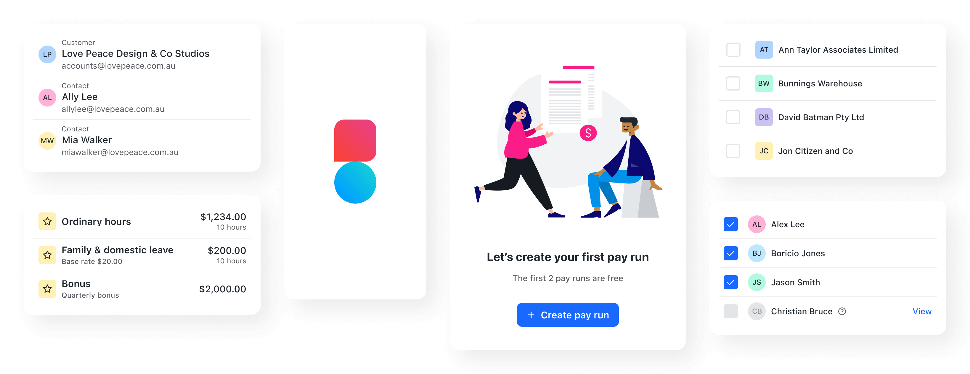
Balance is a React implementation of Reckon's design system. It provides components that are adaptive to interactions and screen sizes across devices, and includes full screen reader and keyboard navigation support for accessibility.

Designing
UI and UX Designers use Figma and this Documentation to make decisions about the best approach to achieve the goals of a project.
View the Figma designs (private)
Developing
Web Developers consult the Figma assets to see which pieces are Balance and which need to be custom-built, and leverage Component examples and requirements as-needed.
React
If you’re new to React, start with the official React getting started documentation. As you read through the topics, follow along using the React Hello World CodePen example.
Here are some additional resources:
- Community resources in Awesome React
- Answers in the various React support communities
TypeScript
If you're new to TypeScript, start by having a read through the handbook.
Here are some additional resources:
- React + TypeScript cheatsheet and demo repo
- Definitely Typed: A GitHub forum containing high-quality TypeScript definition files for common libraries and frameworks.
GraphQL
If you're new to GraphQL, start with the official Introduction to GraphQL docs. You can also browse video content on the How to GraphQL website
Here are some additional resources:
Documentation
A distinct and consistent brand presence sets us apart from competitors, builds trust and familiarity with our customers, and eventually leads to long-term brand value.
Components
Use components as building blocks as you develop new products and features.
Content
Learn how to use language to design a more thoughtful product experience.
Guides
Read the guidance for crafting specific product experiences at Reckon.